Visualizing your data using HPCC Systems
Visualizations are not just charts that are aesthtically pleasing to the eye, they often make it easier to recognise patterns and identify outliers in data which may not be easy to spot otherwise. Visualizing Big Data may provide answers to questions that we either didn’t know to ask at all or help identify emerging trends faster because sometimes it’s just easier to see them this way. Variables can be adjusted dynamically uncovering relationships and patterns which may provide the analysis and predictions needed to improve business results quickly. HPCC Systems includes an open source project “HPCC Visualization Framework” which helps simplify the process of visualizing your data onto a web page.
As well as using the visualizations available from within the framework, it has been designed to be easily extended to be used with new or third party visualizations. All visualizations can also access data directly from an HPCC Systems workunit or deployed Roxie query. I’m going to demonstrate how easy it is to visualize your data using our framework. Demo versions are available showing the visualizations in action and providing the opportunity for you to play around with the features.
Embedding a visualization “widget” onto a webpage – View demo visualization
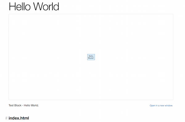
This example demonstrates how to put a simple text box in the required place on a webpage as shown below.
To embed any widget you must:
- Include the framework
- Place a “target” DIV in the web page at the desired location and size.
- “Require” and instanciate the visualization widget.
The Hello Wold sample show how easily this is achieved:
<!doctype html> <html> <head> <meta charset=”utf-8″> <script src=”http://viz.hpccsystems.com/v1.12.2/dist-amd/hpcc-viz.js”></script> </head> <body style=”padding:0px; margin:0px; overflow:hidden”> <div id=”placeholder” style=”width:100%; height:100vh”> </div> <script> require([“src/common/TextBox”], function (TextBox) { var widget = new TextBox() .target(“placeholder”) .text(“HellonWorld!”) .render() ; }); </script> </body> </html>
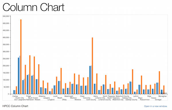
Visualizing local data as a simple column chart – View demo visualization
This can be done by making a few minor changes to the Javascript in the previous example. The only differences are that a column chart is “required”, not a text box and the column chart visualization requires column and data properties to be specified as shown:
<html> <head> <meta charset=”utf-8″> <script src=”http://viz.hpccsystems.com/v1.8.2/dist-amd/hpcc-viz.js”></script> <script src=”http://viz.hpccsystems.com/v1.8.2/dist-amd/hpcc-bundles.js”></script> <script> require.config({ paths: { “src”: “http://viz.hpccsystems.com/v1.8.2/dist-amd”, “font-awesome”: “http://viz.hpccsystems.com/v1.8.2/dist-amd/font-awesome/css/font-awesome.min” } }); </script> </head> <body> <div id=”placeholder” style=”width:100%; height:100vh”> </div> <script> require([“src/chart/Column”], function (Column) { var widget= new Column() .target(“placeholder”) .columns([“Location”, “Males”, “Females”, “Total”]) .data([[“Carlow”, “27431”, “27181”, “54612”], [“Dublin City”, “257303”, “270309”, “527612”], [“Dun Laoghaire-Rathdown”, “98567”, “107694”, “206261”], [“Fingal”, “134488”, “139503”, “273991”], [“South Dublin”, “129544”, “135661”, “265205”], [“Kildare”, “104658”, “105654”, “210312”], [“Kilkenny”, “47788”, “47631”, “95419”], [“Laoighis”, “40587”, “39972”, “80559”], [“Longford”, “19649”, “19351”, “39000”], [“Louth”, “60763”, “62134”, “122897”], [“Meath”, “91910”, “92225”, “184135”], [“Offaly”, “38430”, “38257”, “76687”], [“Westmeath”, “42783”, “43381”, “86164”], [“Wexford”, “71909”, “73411”, “145320”], [“Wicklow”, “67542”, “69098”, “136640”], [“Clare”, “58298”, “58898”, “117196”], [“Cork City”, “58812”, “60418”, “119230”], [“Cork County”, “198658”, “201144”, “399802”], [“Kerry”, “72628”, “72873”, “145502”], [“Limerick City”, “27947”, “29159”, “57106”], [“Limerick County”, “67868”, “66835”, “134703”], [“North Tipperary”, “35340”, “34982”, “70322”], [“South Tipperary”, “44244”, “44188”, “88432”], [“Waterford City”, “22921”, “23811”, “46732”], [“Waterford County”, “33543”, “33520”, “67063”], [“Galway City”, “36514”, “39015”, “75529”], [“Galway County”, “88244”, “86880”, “175124”], [“Leitrim”, “16144”, “15654”, “31798”], [“Mayo”, “65420”, “65218”, “130638”], [“Roscommon”, “32353”, “31712”, “64065”], [“Sligo”, “32435”, “32958”, “65393”], [“Cavan”, “37013”, “36170”, “73183”], [“Donegal”, “80523”, “80614”, “161137”], [“Monaghan”, “30441”, “30042”, “60483”]]) .render() ; }); </script> </body> </html>
The resulting column chart visualisation shows population data for the counties in Ireland, providing a column each for the total population and number of males and females. It clearly shows that the most highly populated counties are Dublin and Cork. Tootltips are available with this chart showing the exact figures for each result.
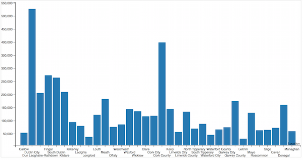
Visualizing data from an HPCC Systems workunit – View demo visualization
This is equally as simple to do. You need access to an HPCC Systems cluster (authentication is required on the ESP) and some ECL to run which will produce the results you want to visualize. In this example, the results will be the total population statistics shown in the previous chart accessed directly from within an HPCC Systems workunit. This is the dataset used to generate the results in our example:
r := record string location; unsigned4 males; unsigned4 females; unsigned4 total; end; d := dataset([{‘Carlow’, ‘27431’, ‘27181’, ‘54612’}, {‘Dublin City’, ‘257303’, ‘270309’, ‘527612’}, {‘Dun Laoghaire-Rathdown’, ‘98567’, ‘107694’, ‘206261’}, {‘Fingal’, ‘134488’, ‘139503’, ‘273991’}, {‘South Dublin’, ‘129544’, ‘135661’, ‘265205’}, {‘Kildare’, ‘104658’, ‘105654’, ‘210312’}, {‘Kilkenny’, ‘47788’, ‘47631’, ‘95419’}, {‘Laoighis’, ‘40587’, ‘39972’, ‘80559’}, {‘Longford’, ‘19649’, ‘19351’, ‘39000’}, {‘Louth’, ‘60763’, ‘62134’, ‘122897’}, {‘Meath’, ‘91910’, ‘92225’, ‘184135’}, {‘Offaly’, ‘38430’, ‘38257’, ‘76687’}, {‘Westmeath’, ‘42783’, ‘43381’, ‘86164’}, {‘Wexford’, ‘71909’, ‘73411’, ‘145320’}, {‘Wicklow’, ‘67542’, ‘69098’, ‘136640’}, {‘Clare’, ‘58298’, ‘58898’, ‘117196’}, {‘Cork City’, ‘58812’, ‘60418’, ‘119230’}, {‘Cork County’, ‘198658’, ‘201144’, ‘399802’}, {‘Kerry’, ‘72628’, ‘72873’, ‘145502’}, {‘Limerick City’, ‘27947’, ‘29159’, ‘57106’}, {‘Limerick County’, ‘67868’, ‘66835’, ‘134703’}, {‘North Tipperary’, ‘35340’, ‘34982’, ‘70322’}, {‘South Tipperary’, ‘44244’, ‘44188’, ‘88432’}, {‘Waterford City’, ‘22921’, ‘23811’, ‘46732’}, {‘Waterford County’, ‘33543’, ‘33520’, ‘67063’}, {‘Galway City’, ‘36514’, ‘39015’, ‘75529’}, {‘Galway County’, ‘88244’, ‘86880’, ‘175124’}, {‘Leitrim’, ‘16144’, ‘15654’, ‘31798’}, {‘Mayo’, ‘65420’, ‘65218’, ‘130638’}, {‘Roscommon’, ‘32353’, ‘31712’, ‘64065’}, {‘Sligo’, ‘32435’, ‘32958’, ‘65393’}, {‘Cavan’, ‘37013’, ‘36170’, ‘73183’}, {‘Donegal’, ‘80523’, ‘80614’, ‘161137’}, {‘Monaghan’, ‘30441’, ‘30042’, ‘60483’}], r); output(d, named(‘ie_population’));
The ECL is run on the HPCC Systems cluster and a workunit is generated. Using ECL Watch, go to the workunit details page, copy the complete URL of the workunit and paste it into the Javascript:
<!doctype html> <html> <head> <meta charset=”utf-8″> <script src=”http://viz.hpccsystems.com/v1.8.2/dist-amd/hpcc-viz.js”></script> <script src=”http://viz.hpccsystems.com/v1.8.2/dist-amd/hpcc-bundles.js”></script> <script> require.config({ paths: { “src”: “http://viz.hpccsystems.com/v1.8.2/dist-amd”, “font-awesome”: “http://viz.hpccsystems.com/v1.8.2/dist-amd/font-awesome/css/font-awesome.min” } }); </script> </head> <body> <div id=”placeholder” style=”width:100%; height:100vh”> </div> <script> require([“src/other/Comms”, “src/chart/Column”], function (Comms, Column) { var widget = new Column() .target(“placeholder”) .columns([“Location”, “Total”]) .render() ; var connection = Comms.createESPConnection(“http://52.51.90.23:8010/?Widget=WUDetailsWidget&Wuid=W20160601-120359”); // URL copied from ECL Watch WU Details Page connection.send({}, function (response) { var data = response.ie_population.map(function (row) { return [row.location, row.total]; }); widget .data(data) .render() ; }); }); </script> </body> </html>
This column chart visualization requires data from two variables, location and total. Notice that initially, an empty request is sent asking for the data which will be returned asynchronously. When the data is available, a second render is required to put the data into the widget.
The live demo version of this visualization accesses the data from a workunit stored on a cloud demo HPCC Systems cluster.
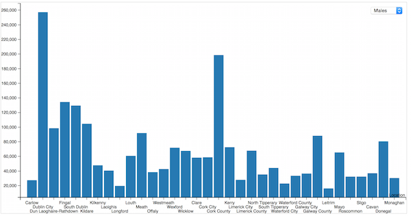
Visualizing data directly from a Roxie query – View demo visualization
Again, you will need access to an HPCC Systems cluster (authentication is required on the ESP) and this time you will need a query to compile and run on the Roxie cluster. The following query ECL was used in this example:
EXPORT SOAPenabling() := FUNCTION varstring pop_type := ‘total’ : stored(‘pop_type’); r := record string location; unsigned4 males; unsigned4 females; unsigned4 total; end; d := dataset([{‘Carlow’, ‘27431’, ‘27181’, ‘54612’}, {‘Dublin City’, ‘257303’, ‘270309’, ‘527612’}, {‘Dun Laoghaire-Rathdown’, ‘98567’, ‘107694’, ‘206261’}, {‘Fingal’, ‘134488’, ‘139503’, ‘273991’}, {‘South Dublin’, ‘129544’, ‘135661’, ‘265205’}, {‘Kildare’, ‘104658’, ‘105654’, ‘210312’}, {‘Kilkenny’, ‘47788’, ‘47631’, ‘95419’}, {‘Laoighis’, ‘40587’, ‘39972’, ‘80559’}, {‘Longford’, ‘19649’, ‘19351’, ‘39000’}, {‘Louth’, ‘60763’, ‘62134’, ‘122897’}, {‘Meath’, ‘91910’, ‘92225’, ‘184135’}, {‘Offaly’, ‘38430’, ‘38257’, ‘76687’}, {‘Westmeath’, ‘42783’, ‘43381’, ‘86164’}, {‘Wexford’, ‘71909’, ‘73411’, ‘145320’}, {‘Wicklow’, ‘67542’, ‘69098’, ‘136640’}, {‘Clare’, ‘58298’, ‘58898’, ‘117196’}, {‘Cork City’, ‘58812’, ‘60418’, ‘119230’}, {‘Cork County’, ‘198658’, ‘201144’, ‘399802’}, {‘Kerry’, ‘72628’, ‘72873’, ‘145502’}, {‘Limerick City’, ‘27947’, ‘29159’, ‘57106’}, {‘Limerick County’, ‘67868’, ‘66835’, ‘134703’}, {‘North Tipperary’, ‘35340’, ‘34982’, ‘70322’}, {‘South Tipperary’, ‘44244’, ‘44188’, ‘88432’}, {‘Waterford City’, ‘22921’, ‘23811’, ‘46732’}, {‘Waterford County’, ‘33543’, ‘33520’, ‘67063’}, {‘Galway City’, ‘36514’, ‘39015’, ‘75529’}, {‘Galway County’, ‘88244’, ‘86880’, ‘175124’}, {‘Leitrim’, ‘16144’, ‘15654’, ‘31798’}, {‘Mayo’, ‘65420’, ‘65218’, ‘130638’}, {‘Roscommon’, ‘32353’, ‘31712’, ‘64065’}, {‘Sligo’, ‘32435’, ‘32958’, ‘65393’}, {‘Cavan’, ‘37013’, ‘36170’, ‘73183’}, {‘Donegal’, ‘80523’, ‘80614’, ‘161137’}, {‘Monaghan’, ‘30441’, ‘30042’, ‘60483’}], r); r2 := record string location; unsigned4 total; end; r2 totTrans(r l) := transform self.location := l.location; self.total := map (pop_type = ‘total’ => l.total, pop_type = ‘male’ => l.males, pop_type = ‘female’ => l.females, 0); end; return output(project(d, totTrans(LEFT)), named(‘ie_population’)); end; SOAPEnabling();
Once you have compiled and published your query to the Roxie, use ECL Watch to go to the query details page and copy the complete URL, which you can then paste into the Javascript for your visualization.
The Javascript required is virtually identical to the previous example. But there are three differences to note. Firstly, the URL used in this example is for a Roxie query not a workunit. Secondly, notice the drop down list of options which when selected, change the results shown in the visualization at run time. Finally, the Javascript in this example, does not contain an empty request for the data. Instead, the population type is sent direct from the Roxie query.
<!doctype html> <html> <head> <meta charset=”utf-8″> <style type=”text/css”> .topcorner { position: absolute; top: 8px; right: 8px; } </style> <script src=”http://viz.hpccsystems.com/v1.8.2/dist-amd/hpcc-viz.js”></script> <script src=”http://viz.hpccsystems.com/v1.8.2/dist-amd/hpcc-bundles.js”></script> <script> require.config({ paths: { “src”: “http://viz.hpccsystems.com/v1.8.2/dist-amd”, “font-awesome”: “http://viz.hpccsystems.com/v1.8.2/dist-amd/font-awesome/css/font-awesome.min” } }); </script> </head> <body> <div pos></div> <div id=”placeholder” style=”width:100%; height:100vh; z-index:100″> </div> <select id=”popType” class=”topcorner” onchange=”doQuery()”> <option value=”male”>Males</option> <option value=”female”>Females</option> <option value=”total”>Total</option> </select> <script> var applyFilter; require([“src/other/Comms”, “src/chart/Column”], function (Comms, Column) { var widget = new Column() .target(“placeholder”) .columns([“Location”, “Total”]) .render() ; var connection = Comms.createESPConnection(“http://52.51.90.23:8010/?QuerySetId=roxie&Id=ie_pop.1&Widget=QuerySetDetailsWidget”); // URL copied from ECL Watch Roxie Details Page applyFilter = function (popType) { connection.send({ pop_type: popType // male, female, total }, function (response) { var data = response.ie_population.map(function (row) { return [row.location, row.total]; }); widget .data(data) .render() ; }); } doQuery(); }); function doQuery() { if (applyFilter) { applyFilter(document.getElementById(“popType”).value); } } </script> </body> </html>
The chart visualizes a single result set at a time, depending on the option selected in the drop down list and tooltips are also available.
The live demo version of this visualization accesses the data from a Roxie query stored on a cloud demo HPCC Systems cluster.
Changing between visualization types – View demo visualization
The Megachart visualization contains a few extra features (for example, title) and demonstrates how you can change between chart types easily. You can get an idea of how it works below but it’s best viewed using the demo page. This is what the Javascript looks like using the population data we have used in previous examples:
<!doctype html> <html> <head> <meta charset=”utf-8″> <script src=”http://viz.hpccsystems.com/v1.10.0-rc6/dist-amd/hpcc-viz.js”></script> <script src=”http://viz.hpccsystems.com/v1.10.0-rc6/dist-amd/hpcc-bundles.js”></script> <script> require.config({ paths: { “src”: “http://viz.hpccsystems.com/v1.10.0-rc6/dist-amd”, “font-awesome”: “http://viz.hpccsystems.com/v1.10.0-rc6/dist-amd/font-awesome/css/font-awesome.min” } }); </script> </head> <body> <div id=”placeholder” style=”width:100%; height:100vh”> </div> <script> require([“src/composite/MegaChart”], function (MegaChart) { var widget = new MegaChart() .target(“placeholder”) .title(“HPCC MegaChart”) .showChartSelect(true) .columns([“Location”, “Males”, “Females”, “Total”]) .data([[“Carlow”, “27431”, “27181”, “54612”], [“Dublin City”, “257303”, “270309”, “527612”], [“Dun Laoghaire-Rathdown”, “98567”, “107694”, “206261”], [“Fingal”, “134488”, “139503”, “273991”], [“South Dublin”, “129544”, “135661”, “265205”], [“Kildare”, “104658”, “105654”, “210312”], [“Kilkenny”, “47788”, “47631”, “95419”], [“Laoighis”, “40587”, “39972”, “80559”], [“Longford”, “19649”, “19351”, “39000”], [“Louth”, “60763”, “62134”, “122897”], [“Meath”, “91910”, “92225”, “184135”], [“Offaly”, “38430”, “38257”, “76687”], [“Westmeath”, “42783”, “43381”, “86164”], [“Wexford”, “71909”, “73411”, “145320”], [“Wicklow”, “67542”, “69098”, “136640”], [“Clare”, “58298”, “58898”, “117196”], [“Cork City”, “58812”, “60418”, “119230”], [“Cork County”, “198658”, “201144”, “399802”], [“Kerry”, “72628”, “72873”, “145502”], [“Limerick City”, “27947”, “29159”, “57106”], [“Limerick County”, “67868”, “66835”, “134703”], [“North Tipperary”, “35340”, “34982”, “70322”], [“South Tipperary”, “44244”, “44188”, “88432”], [“Waterford City”, “22921”, “23811”, “46732”], [“Waterford County”, “33543”, “33520”, “67063”], [“Galway City”, “36514”, “39015”, “75529”], [“Galway County”, “88244”, “86880”, “175124”], [“Leitrim”, “16144”, “15654”, “31798”], [“Mayo”, “65420”, “65218”, “130638”], [“Roscommon”, “32353”, “31712”, “64065”], [“Sligo”, “32435”, “32958”, “65393”], [“Cavan”, “37013”, “36170”, “73183”], [“Donegal”, “80523”, “80614”, “161137”], [“Monaghan”, “30441”, “30042”, “60483”]]) .render() ; }); </script> </body> </html>
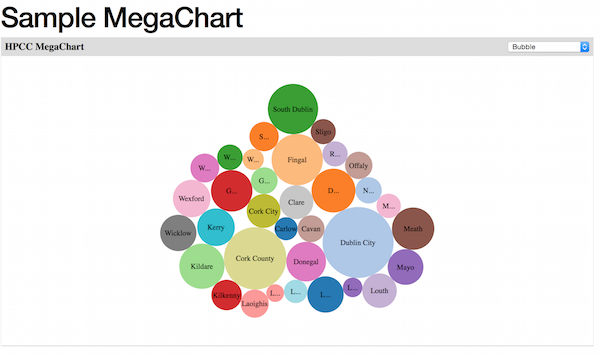
The Megachart visualization provides a drop down list of available charts you can select to display the same data in many different ways. Here’s the data presented as a bubble chart:
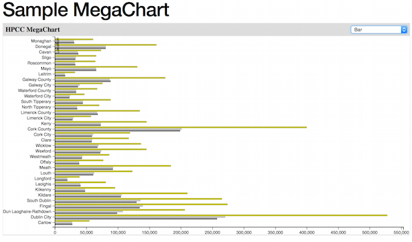
Using the drop down, you have many more charts types available to you in one click to view the same data as, for example, a regular bar chart:
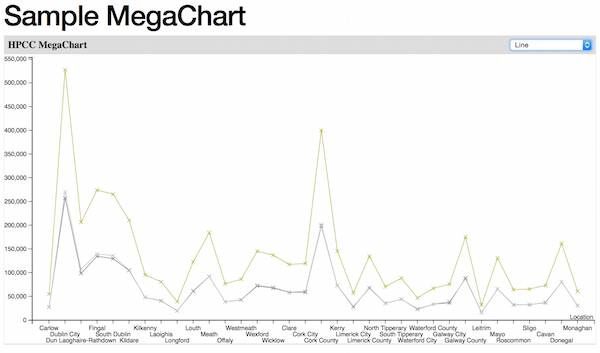
Or regular line chart:
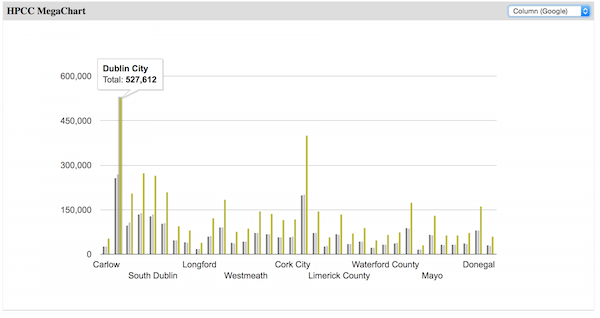
Or Google column chart and more:
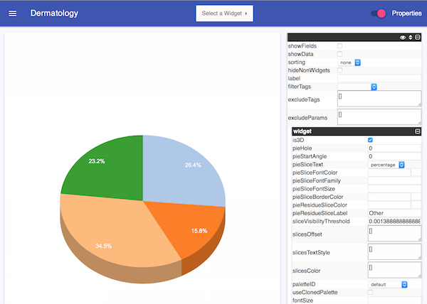
Using HPCC Systems Dermatology Page – View Dermatology Page
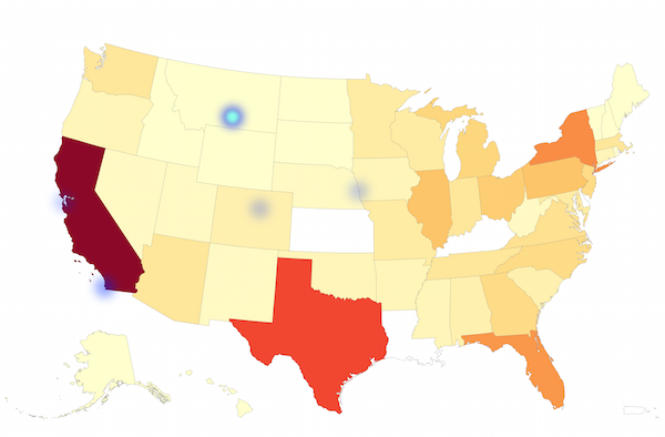
This is our self test and demo page. Use this page to browse all the widgets we currently support and experiment with their properties. There are many different widgets available not just those demonstrated in this blog, for example,a Choropleth heatmap of the USA:
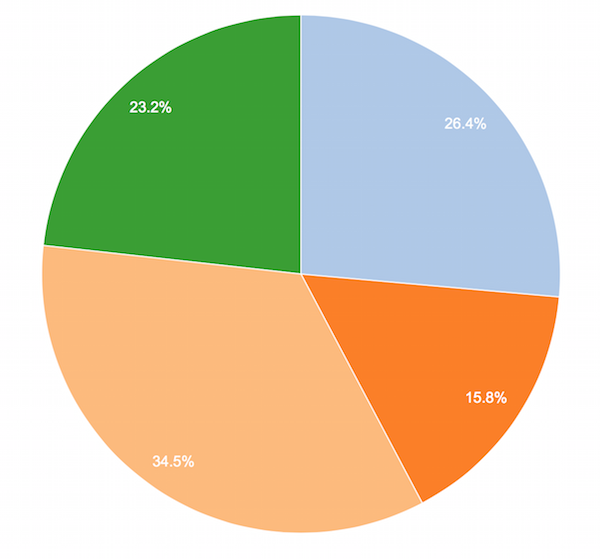
A Pie chart:
Make it 3D immediately by simply checking the is3D property:
If you want to look at the sources for any of these widgets, go to the Visualizations Project in the HPCC Systems GitHub repository. You can also contact us with questions or comments via the HPCC Systems Developer Forum or the Visualizations room on Gitter.
Notes:
- Download the latest HPCC Systems release and ECL IDE/Client Tools.
- Read the supporting documentation.
- Take a test drive with the HPCC Systems 6.0.x VM.
- Tell us what you think. Post on our Developer Forum.
- Let us know if you encountered problems using our Community Issue Tracker.