COVID-19: Is there a better way to tell the story?
As the COVID-19 crisis started to unfold in the US and around the world, some of my colleagues and I at LexisNexis Risk Solutions became frustrated with the quality of the information available on the developing crisis. Public data sites presented the raw statistics, but provided very little analysis or context with which to understand exactly what was going on.
We decided to take advantage of HPCC Systems Data Lake Technology to create our own portal to see if we could add value to the data and provide a better contextual understanding of the state and evolution of the pandemic.
This has resulted in the HPCC Systems Covid-19 tracker which has recently been made available for public use here.
The COVID-19 Tracker is designed to provide insights for use by health officials, researchers, and curious individuals around the world. It allows map-based browsing at the Country, State, and County levels.
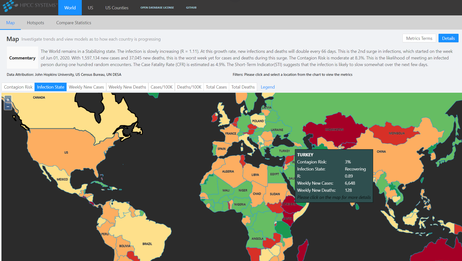
It also provides a Hot Spots view that identifies the locations that require the most critical intervention.
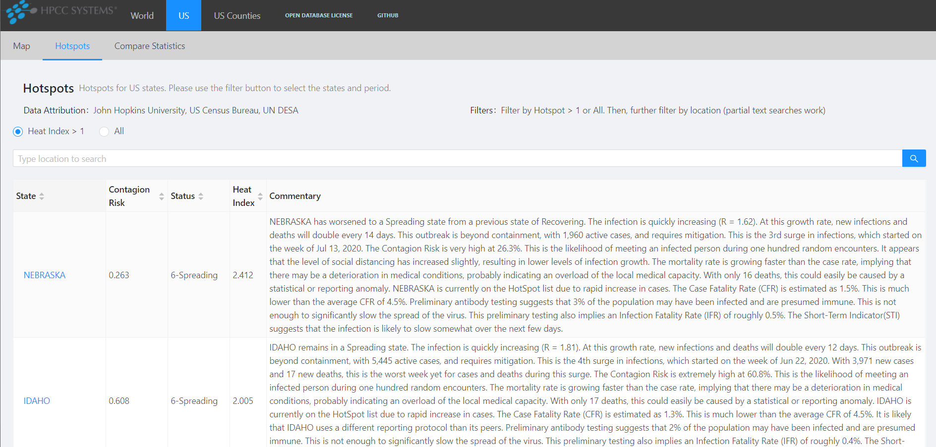
For each location, a set of metrics is presented, as well as a narrated commentary to help interpret the metrics.
After creating the Data Lake and ingesting the publicly available data, we began to investigate how to process that data in ways that provide additional insights.
We started by embedding an epidemiological model known as SIR that allowed us to estimate the number of active infections for any location, as well as the number of individuals who recovered.
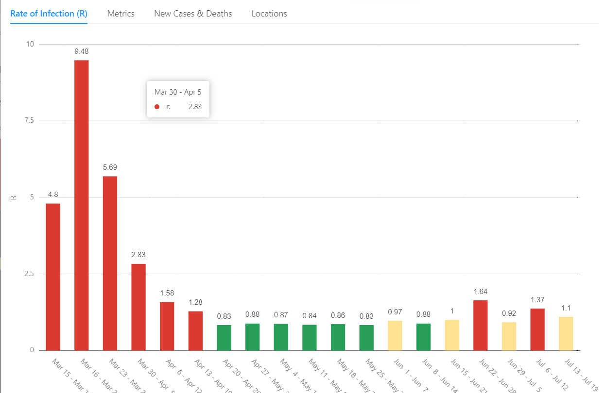
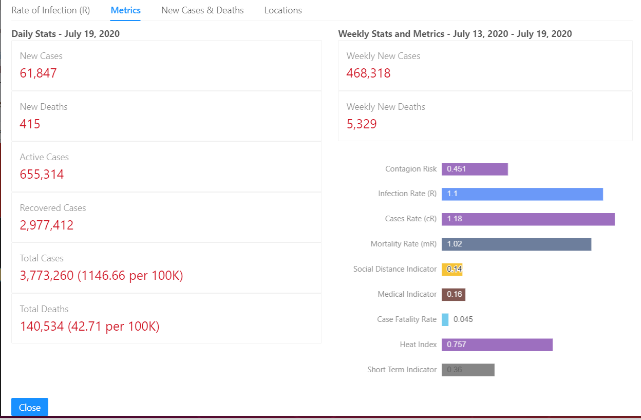
A vitally important metric known as R represents the effective reproductive rate of the virus within a location. It is defined as the average number of people who are infected by each infected individual during the course of their illness. When each infected individual infects one other, the number of active cases will remain stable. This is indicated by an R of around 1.0. R values greater than 1.0 imply that the number of active cases are increasing. With an R of 2.0 for example, the number of active cases will double every 10 days. Likewise, an R less than 1.0 implies that the number of active infections is shrinking. An R of .5 means that active cases will halve about every 10 days.
The available data gave us two different representations of R:
- cR — The case growth rate reflects the compound growth of confirmed cases.
- mR — The mortality growth rate reflects the compound growth rate of deaths.
Each of these metrics are useful in their own right, but also provide proxies for the computation of R. cR is dependent on the testing policies and testing availability at each location. mR is somewhat more reliable, being less influenced by testing availability, but is also lagged versus the case rate. By combining the two, we produced a better estimation of the true R.
During the early growth phases of an epidemic, the primary driver of growth rate is the level of unprotected contact between people. We know this as Social Distance.
We can therefore use changes in R as an indication of the level of Social Distancing within a location. This allowed us to develop an metric known as the Social Distance Indicator (SDI). This indicator is designed to be negative when there is a decrease in social distance, and positive when social distance is increasing. We define all of our indicators such that negative numbers imply negative outcomes and vice versa.
When the growth of an infection is steady, and other factors are constant, both case and mortality growth rates will be similar. We noticed that the ratio of the two can provide insight into the medical conditions on the ground at a given location. This led to the definition of a Medical Indicator (MDI) that reflects these changes. We found that this can identify several situations that influence medical care:
- Constrained testing
- Overloaded medical institutions
If either of these situations appear to be occurring, the MDI will turn negative. Likewise if these are improving, the MDI will turn positive. Examining other factors allows us to determine which of these situations is likely to be triggering the MDI.
We created a qualitative metric called Infection State that maps the state and stage of an infection across its life cycle. This allows you to quickly see where infections are growing, shrinking, or stabilizing. We can also track the individual surges of infection in each location and identify progress in the mitigation effort.
While growth rates, medical conditions and social changes are invaluable knowledge for health officials, as individuals we might be more concerned with how deeply the infection has spread into our communities. By bringing in population data, we can produce statistics such as Cases-per-capita and Deaths-per-capita. This allows us to compare statistics across communities of different sizes. Contagion Risk is a very useful comparative statistic. This is the probability of encountering at least one actively infected individual during one hundred random encounters. This allows an individual to assess the relative risk of a casual walk down the street or dining at a local restaurant.
The above metrics, and others that we haven’t discussed, can provide a deep view into the state and evolution of the pandemic with a location. Interpreting these metrics, however, require some understanding of how each one works, what they imply, and how they inter-relate. So we created a commentary that provides an expert narration, interpreting the metrics for those who don’t spend hours staring at the numbers. This commentary is designed to provide a balanced and robust view of the state and direction of the infection within a location, as well as the implications based on the infection’s current state. These commentaries are produced several times a day for each Country, State, and County. Here is an example:
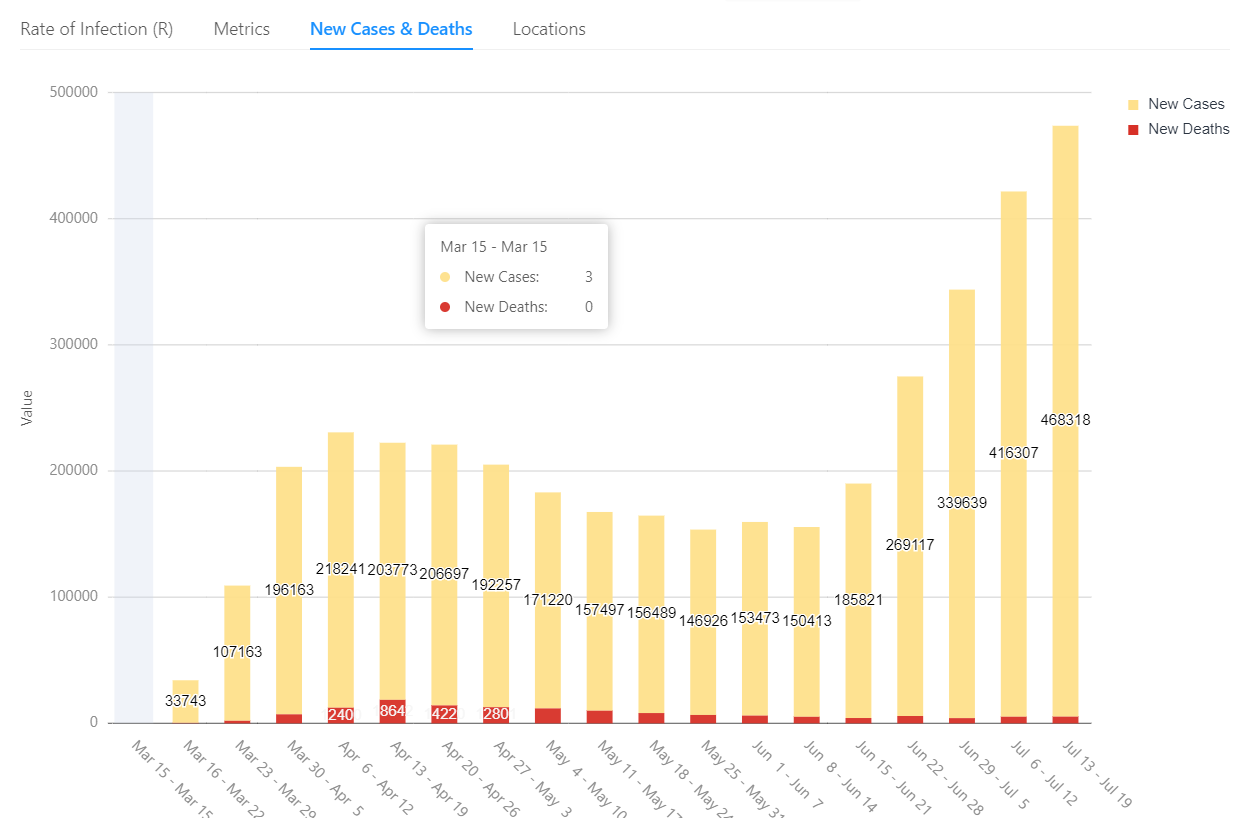
As of July 20, 2020, the US remains in a Stabilizing state. The infection is slowly increasing (R = 1.1). At this growth rate, new infections and deaths will double every 73 days. This is the 2nd surge in infections, which started on the week of Jun 22, 2020. With 468,318 new cases, this is the worst week so far for cases during this surge. The Contagion Risk is very high at 45.1%. This is the likelihood of meeting an infected person during one hundred random encounters. It appears that the level of social distancing has increased slightly, resulting in lower levels of infection growth. The Case Fatality Rate (CFR) is estimated as 4.5%. This is consistent with the average CFR of 4.9%. Preliminary antibody testing suggests that 3% of the population may have been infected and are presumed immune. This is not enough to significantly slow the spread of the virus. This preliminary testing also implies an Infection Fatality Rate (IFR) of roughly 1.5%. The Short-Term Indicator (STI) suggests that the infection is likely to slow somewhat over the next few days.
This project illustrates the power of the HPCC Systems platform and the Data Lake methodology to quickly extract valuable information and insight from readily available data. These metrics and visualizations were not developed in a vacuum. They are the result of an iterative methodology that layers knowledge upon knowledge to continuously extract deeper and deeper insights data.
For an overview of the Data Lake methodology, and how it supports this process, please see our Data Lake Management White Paper. For a deeper understanding of the COVID-19 Tracker project and its philosophy, please see our Project Documentation on GitHub. For more information on how LexisNexis Risk Solutions uses the HPCC Systems platform, please see their technology overview.
And please visit our COVID-19 Tracker and gain insights into the status of the pandemic within your location.