Visualizing ECL and sharing your results – The HPCC Systems Visualizer
Wherever you look these days, analysts are providing visual representations of the data they mine to help businesses make decisions. Since data is our business, this is something we have been doing for some time now, using the visualization capabilities built in to HPCC Systems®.
The new HPCC Systems Visualizer Bundle allows you to visualize results generated by your ECL code rather than relying on javascript.
It is open source just like the HPCC Systems platform, ECL IDE, Machine Learning Library, embedded language and data store support.
Four types of visualizations are included in the new HPCC Systems Visualizer bundle:
- Two dimensional charts such as chart, pie and bubble
- Multi-series and dimensional charts, such as bar and column
- Geospatial, such as choropleths
- General tables/grids which can display any data rather than data specific shapes
The bundle also includes an internal self test (Visualizer.ecl), which when run, provides a minimal example of its use including some examples of these different visualization types.
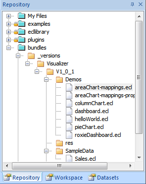
Also included is a Demos folder which contains some more complete examples, including:
- Field mappings
- Filtering (dashboarding)
- Dermatology properties (look and feel)
The Visualizer bundle can be installed with any IDE, provided you have already installed the HPCC Systems Client Tools. Since the installation of the bundle requires the use of the ecl command line tool, users may find it easier to set their local PATH to include the specific version of the ECL Client Tools that they use with the following command:
set PATH=%PATH%;"c:Program Files (x86)HPCCSystems%version%clienttoolsbin"
Where %version% is the client tools version you have installed.
Download the bundle zip file from the HPCC Systems Visualizer github repository and extract it on to your computer. The installation instructions recommend that you extract into a folder called Visualizer in your downloads folder.
Note: On windows the default “extract” option tends to unzip the files into an additional nested folder, which can cause the install to fail. Simply move the files to the correct folder one level up to work around this.
You can then use the ecl command line to install the Visualizer using the following command:
ecl bundle install %USERPROFILE%DownloadsVisualizer
You can also install the Visualizer direct from GitHub, but to do this both the HPCC Systems Client Tools and git must be installed and available in the path:
ecl bundle install https://github.com/hpcc-systems/Visualizer.git
For the purposes of this blog, I have chosen to use our ECL IDE and view the visualizations using ECL Watch in a browser. Once the Visualizer is installed, the self test files are automatically available in the Visualizer/Demos repository as shown below:
There are a few simple visualization jobs you can use to view the ECL code and see the Visualizer in action:
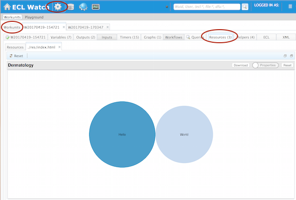
helloWorld.ecl – This self test uses an inline 2D dataset to create a 2D bubble chart. Either double-click on the helloWorld.ecl file or right-click and Open in Builder Window. Look at the ECL to see how it works:
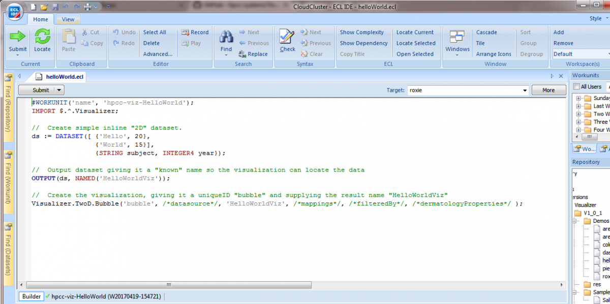
Submitting the job to the target cluster creates a unique workunit, which you can view in ECL Watch(1) from within the ECL IDE by clicking on the workunit name and ID.
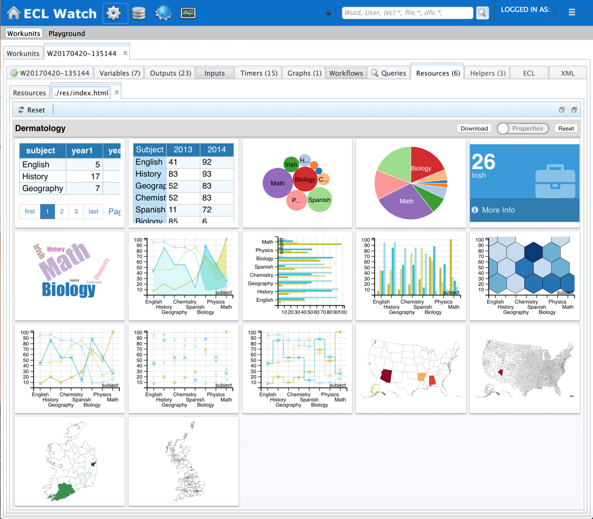
You can also use ECL Watch from within in your browser (http://<esp IP Address>:8010) which gives you more screen real estate for viewing the visualizations (as shown below). In the ECL area, click on the workunit ID and use the Resources tab to view the charts which are displayed in html.
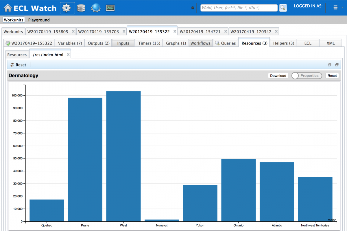
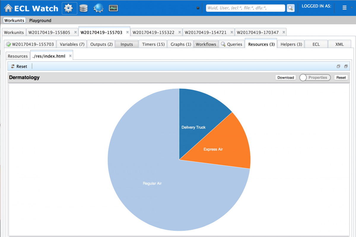
There are also examples for simple 2D column and Pie chart visualizations:
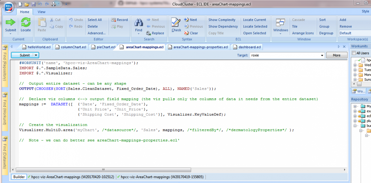
In the previous examples the data was exactly the shape that the visualizations expected, but often you may have many columns in your results and only want to visualize a specific set of columns. The areaChart-mappings.ecl self test, illustrates how you extract only the columns you want from a larger data set and how to map those columns to the visualization, by specifying a ‘mappings’ dataset in your ECL code:
This is the corresponding visualization:
Look and feel – Dermatology
When viewing a chart (especially from the previous example), you may not be 100% happy with its appearance, this is where the dermatology Properties come in. The dermatology (the skin) of the chart can be tweaked in two different ways:
- By pressing the Properties button while viewing the chart on the Resources tab in ECL Watch and clicking Save when done.
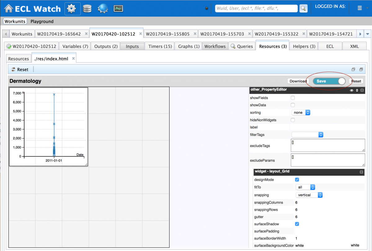
- By setting the properties directly in the ECL code
I started by editing the look and feel visually using the first method and once I was happy, I was able to move those new settings into the ECL code. The next self test, areaChart-mapping-properties.ecl, is an example of how this works.
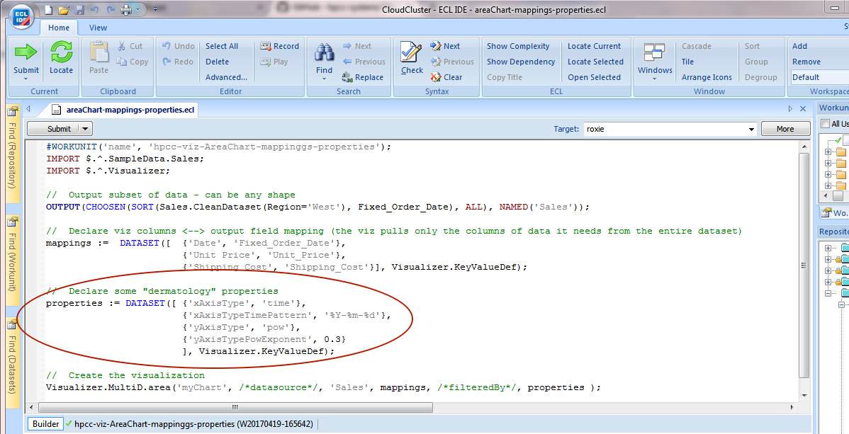
The areaChart-mappings-properties.ecl self test illustrates not only how you can set the mappings for the data you want to view, but also how to declare in advance the properties you want to use to display the results by specifying a ‘properties’ dataset.
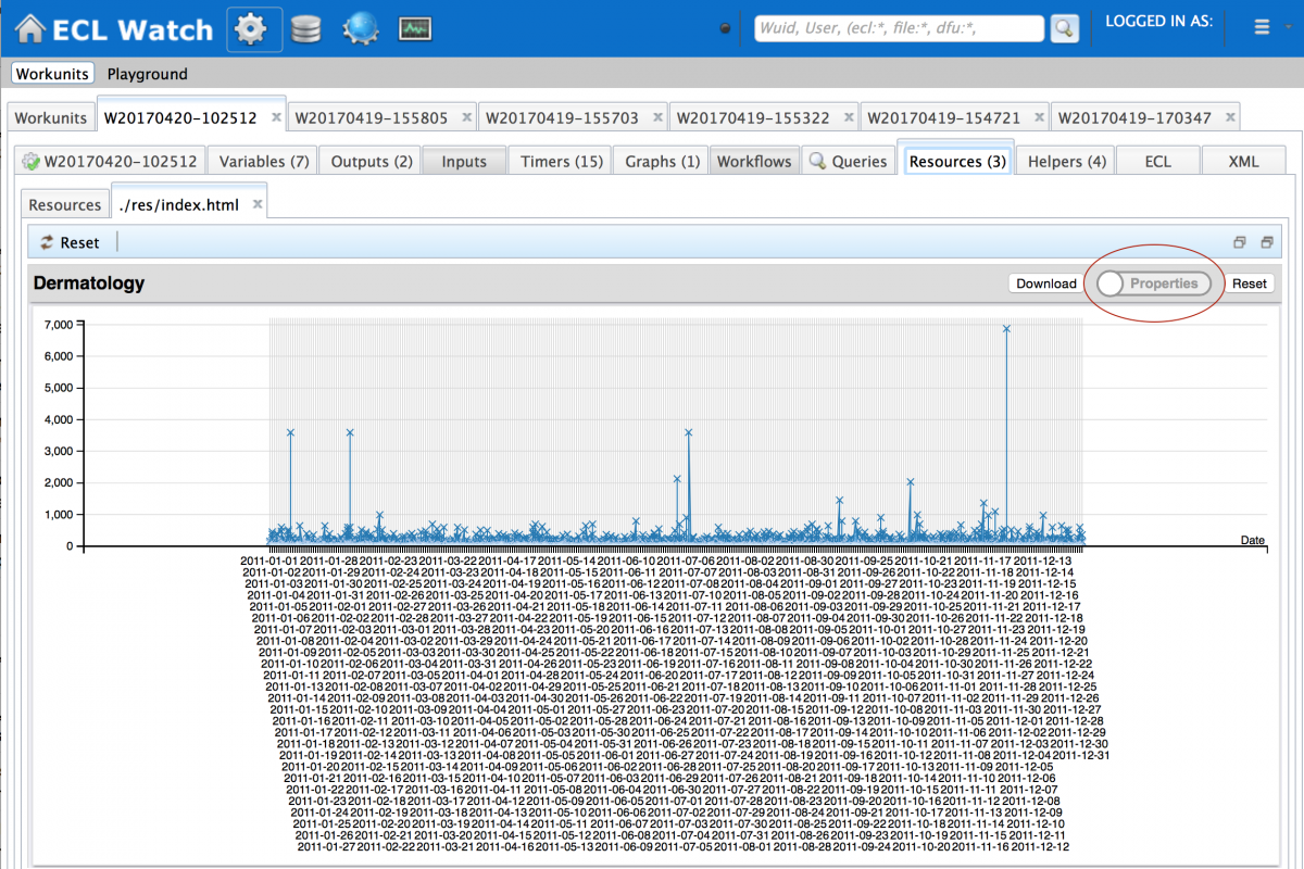
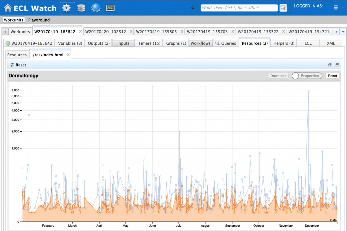
The resulting chart makes a better job of displaying the data in a much more meaningful visualization:
Now let’s look at a dashboard showing a number of visualizations displaying different columns of data from the larger dataset. Note that the area line chart shown without results, includes a filter parameter which is filtered by the other charts shown on the dashboard.
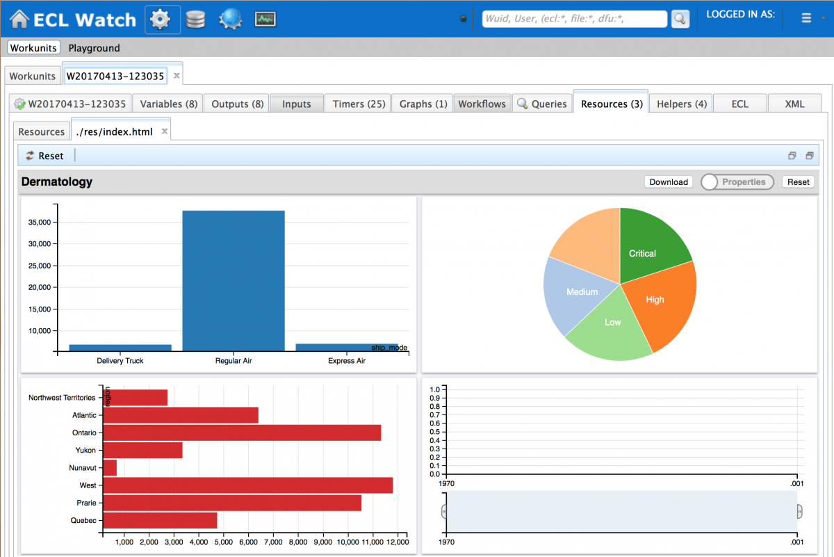
Clicking on the results shown on the column, bar and pie charts, causes the line chart to change to show only the results you have asked to display. Selected results are indicated by a red border which is toggled on and off by a click.
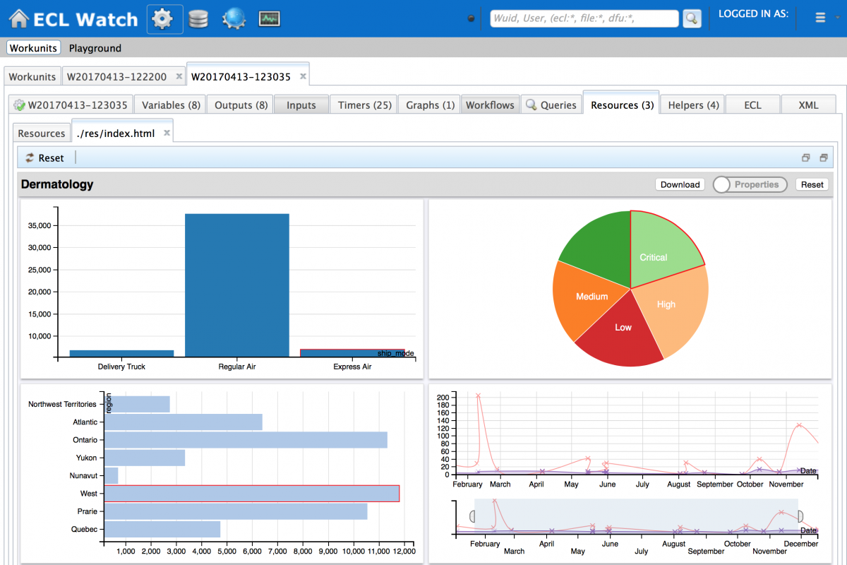
By arranging the charts on the page as you wish, you can create a dashboard view of the all the charts you want to see concurrently. I thought it might make more sense to display the line chart the full width of the page with the others below:
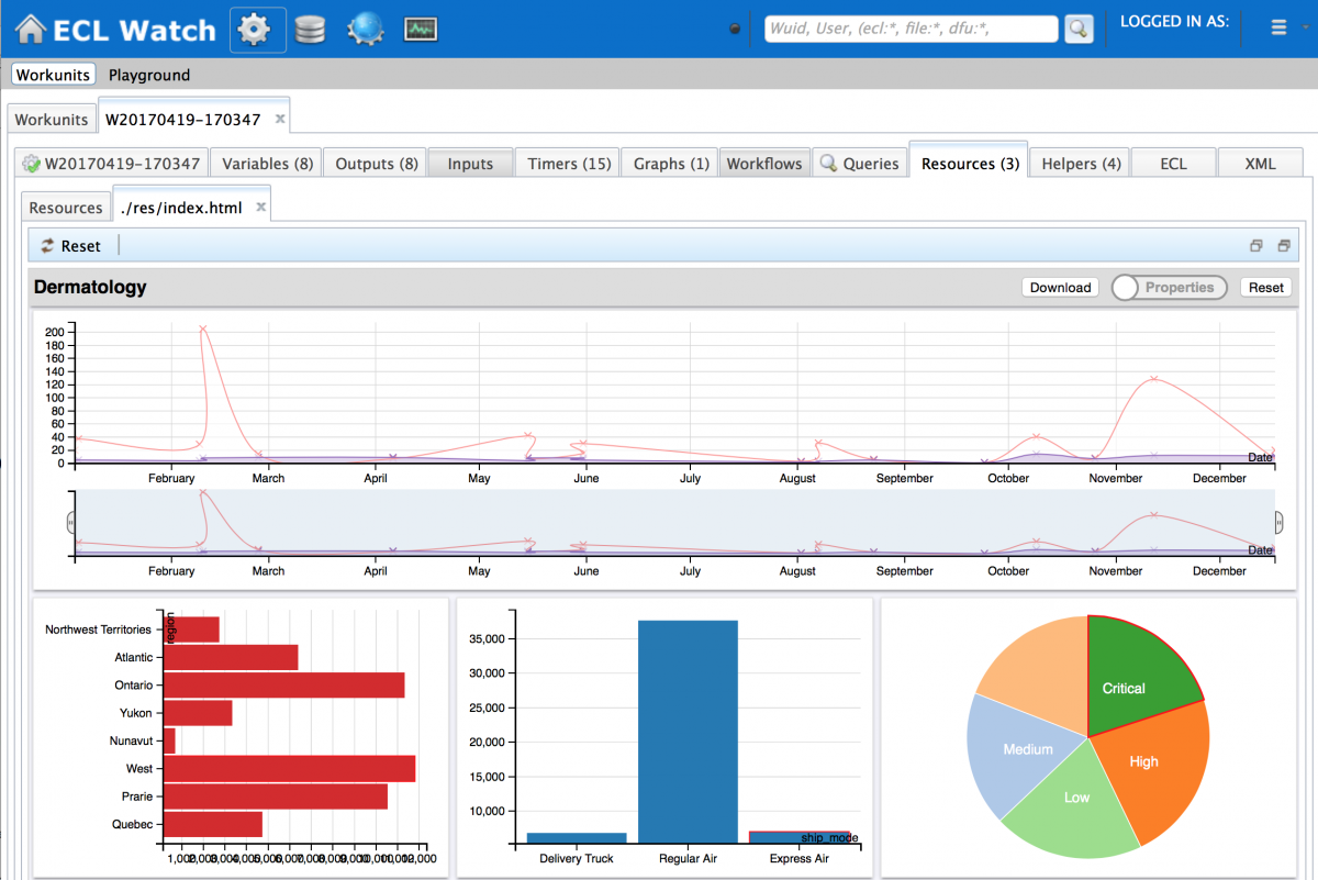
Once saved, this dashboard showing the visualizations with the properties you have chosen, is preserved for future viewing.
Sharing your visualization
The chances are, that at some stage, you will want to share your visualizations with others, there are two common approaches to do this:
- Provide a direct URL to the embedded chart
The simplest way to do this is to click on the Open in new tab button in the top right hand corner of the Resources page and then share that URL. But you should note that this will only work if you are sharing with others who also have access rights to ECL Watch.
 - Download a “canned” version of the dashboard
To do this, use the Download button, which allows you to preselect a few items to be included. You can then email the resulting html file (including the dashboard definition) and the recipients can see your charts exactly as you viewed them. While the download feature also works with “dynamic” dashboards, it’s worth noting that if your recipient clicks on filter combinations not included in the downloaded html file, they will need access to the HPCC Platform that hosts the data and may be prompted for their login details to see the new results they have just requested.
Data sources
All the previous examples have assumed that the source data has been self contained in the current workunit, but it is worth noting that you can specify the following data sources:
- Current WU + Result Name
- Other WU + Result Name
- Logical File
- Roxie Query
As well as using the Visualizer bundle to carry out data analytics, another use might be to add a visualization into a large job you run regularly, so you can see how that job ran giving the additional benefit of allowing you to compare the results of subsequent runs of the same job.
Notes:
- ECL Watch is the web based UI supplied with the HPCC Systems platform which provides an interface to the whole system, including monitoring the health of all components, running and completed workunits and queries, access to results and user permissions etc. It is accessed using your browser, specifying the IP address of the ESP component followed by the port 8010 (http://<esp IP Address>:8010)
- More information is available in the Visualizing ECL Results manual.
- The test script and sample data can be found in the Visualizer github repository.
- You can still visualize results from your data using javascript. For more information see the earlier blog Visualizing your Data using HPCC Systems®